What are the best tile colours to pair with stone benchtops in New Zealand?
The best tile colours to pair with stone benchtops in NZ for 2026 are:
- Warm whites and soft neutrals
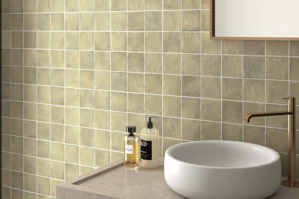
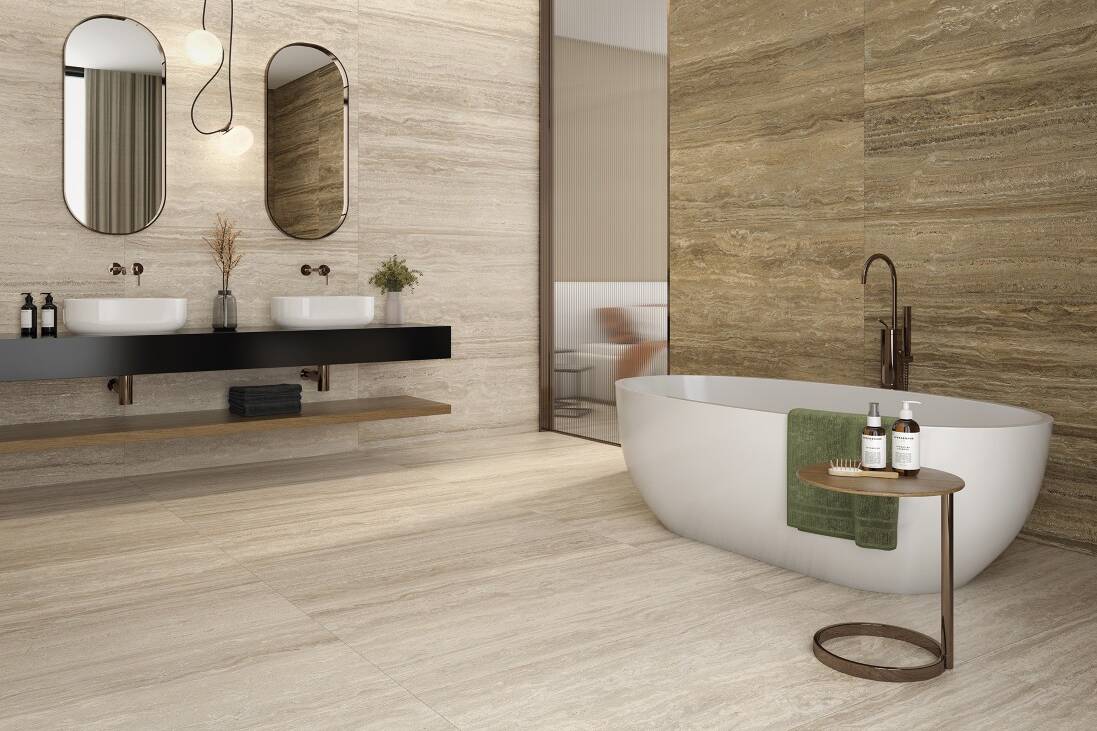
- Beige, taupe and sand tones
- Terracotta and clay colours
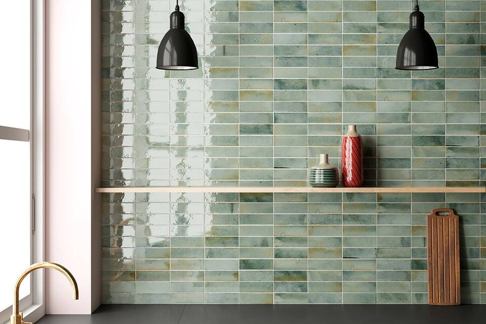
- Muted greens
- Tonal colour-on-colour combinations
These colours work because modern interiors are shifting toward natural, earthy palettes and layered tones, rather than contrast-heavy or stark designs.
Why is matching tile colour to stone benchtops so important?
Your splashback and benchtop are the two largest visual surfaces in a kitchen. Getting them right:
- Creates a cohesive, high-end look
- Avoids visual clutter or colour clashes
- Makes the space feel more intentional and architectural
In 2026 design, the goal is not contrast — it’s harmony and material layering.
What is the best tile colour for white stone benchtops?
Best match: Warm white, soft beige, or subtle texture tiles
Xtone slabs like soft white marble-look stones (e.g. Glem White, Aria White or the bold Invisible White style tones) pair best with tiles that:
- Are slightly warmer than the benchtop
- Have texture or variation
- Avoid being too bright or clinical
Use:
- Handmade-look white tiles
- Off-white (not pure white)
- Light sand or ivory tones
Why it works:
Layering slightly different whites creates depth, rather than a flat, sterile look.
What tile colours work with marble-look stone benchtops?
Best match: Tone-on-tone neutrals or soft contrasting colours
Many Xtone slabs feature veining and movement. To balance this:
- Keep tiles simple in colour
- Let the benchtop be the feature
- Avoid overly busy patterns
Best tile pairings:
- Soft taupe
- Light greige
- Warm white
- Muted green (very popular in 2026)
Stone already provides texture — your tile should support it, not compete.
What tiles go with dark stone benchtops?
Best match: Lighter contrasting tones or warm mid-tones
For darker Xtone slabs like Calatorao, Breccia Imperiale or Aged Dark :
Use:
- Soft white tiles
- Warm beige
- Light taupe
- Subtle textured neutrals
Avoid:
- Bright white (too harsh contrast)
- Cold greys (dated look)
Why:
Warmer contrast creates a more refined, high-end finish than sharp black-and-white combinations.
Can you match tile colour exactly to your stone benchtop?
Yes — and this is actually one of the biggest design trends for 2026.
This approach is called “tonal layering”:
- Similar colours
- Slight variation in texture and finish
- Low contrast, high cohesion
This creates a seamless, architectural look often used in:
- High-end kitchens
- Designer homes
- Modern renovations
What tile colours work with beige or warm stone benchtops?
If your Xtone slab sits in the beige / travertine / warm stone family like Bottega Caliza, Calacatta Gold, Ceppo Carabelas, Navona or the stunning new Vendome, your best options are:
- Terracotta tiles
- Soft browns
- Sand / clay colours
- Muted greens
These colours reflect a growing trend toward earth-based palettes and biophilic design, which bring warmth and calm into interiors
Are green tiles a good match with stone benchtops?
Yes — green is one of the strongest trends for 2026.
Muted greens work particularly well with:
- Marble-look slabs
- Warm white stone
- Travertine-style benchtops
They add:
- A natural, calming feel
- Depth without overpowering
- A strong designer aesthetic
What tile finish works best with stone benchtops?
The best finishes to pair with stone are:
Matte tiles
- Complement natural stone finishes
- Softer and more architectural
Handmade / textured tiles
- Add contrast against smooth stone
- Create depth and visual interest
Subtle gloss (selectively)
- Works with classic styles
- Helps reflect light in smaller kitchens
Trend direction is strongly toward tactile, textured materials, not flat surfaces
Should your splashback or benchtop be the feature?
One should lead, the other should support
- If you choose a bold Xtone slab → keep tiles simple
- If you choose a simple slab → you can go more expressive with tiles
This balance is key to achieving a premium result.
What are the biggest mistakes when pairing tiles with stone benchtops?
Avoid these:
- ❌ Matching white tiles with white stone exactly (looks flat)
- ❌ Using cold greys with warm stone (clashes visually)
- ❌ Competing patterns (tile + stone both busy)
- ❌ High contrast without intention
Instead, aim for: Layered colour + texture + restraint
What is the best overall tile colour strategy for 2026 kitchens?
The strongest approach right now is:
Natural stone + warm tile + subtle texture
Across NZ design projects, we are seeing:
- Less harsh contrast
- More tonal consistency
- A focus on materials that feel real and timeless
Where can I see Xtone stone slab options?
Explore the full range of XTONE stone slabs here:
View XTONE Slab Collection
Final takeaway
If you take one rule from this:
Don’t match colour — match feeling
The best kitchens in 2026 are not built around contrast or trends, but around:
- Warmth
- Texture
- Cohesion
When your splashback tile complements your XTONE benchtop instead of competing with it, the result is a space that feels effortless, timeless, and high-end.